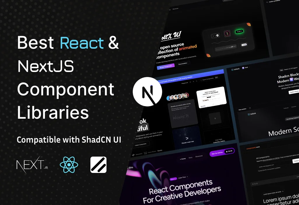
Best React and NextJS Component Libraries Compatible with ShadCN UI
September 16, 2025
When your workflow involves NextJS Component Libraries, such as ShadCN UI – an elegant, headless, and wind-driven CSS-based component system – which initially integrates the library’s libraries, you can take your user interface to the next level with it. In this post, we will explore seven standout libraries and tools: Aceternity UI, React Bits, Tailorks, Magic UI, and Components. And focus on pre-built UI blocks and customizable components.

1. Aceternity UI – Animated Effects on Steroids
Overview: Using React, Next.js, Tailwind CSS, and Framer Motion, Aceternity UI provides a free, open-source collection of beautiful animated effects and components.
Why it’s great:
- Deep compatibility with Shadcn Ui, and copies the first, utilized style.
- More than 53 include an animated react component and visually attractive effects such as dynamic background and interactive card.
- Offers an interactive playground where developers can use in real time and copy voyage component code.
- NextJS and Tailwind are designed for developers who love motion -driven user interfaces.
Ideal use case: Use this library to increase the Shadcn-based interface with a live animation tank of motion or content cards with intercitative flares as well as heroic sections.

2. React bits – easily animated building block
Overview: React bits is an open source collection of high quality, animated, interactive and adaptable response components that focus on text animation, background and general Ui
Why it’s great:
- Designed to be flexible—blend various animation paradigms like GSAP, react-spring, or Framer Motion without overcommitting.
- Provides modularity: text animations, background effects, and regions that can be dropped into shadcn layouts.
Ideal Use-Case: Ideal for sprinkling micro-animations—animated headings, moving backgrounds, or subtle hover effects—without overloading your bundle.

3. Tailark – ShadCN friendly marketing block (customizable components)
Overview: Tailark, a specialist in responsible UI blocks, is designed for marketing pages. It supports Shadcn Ui, NextJS, and Tailwind CSS with a free and Premium Block Library.
Why It’s Great:
- Provides hero sections, features, team displays, pricing tables, FAQ, contact forms, and more—all shadcn-friendly
- With Tailark Quartz, you get an enterprise-grade kit packed with hundreds of blocks, whether you prefer using the CLI or just dropping them in manually.
- On the other hand, Tailark Mist brings you Notion-style marketing components that are perfect for responsive design.
Ideal Use Case: If your goal is to whip up content-rich landing pages in no time, Tailark is your go-to for efficiently piecing together UI sections while keeping everything in line with your ShadCN design language.

4. Magic UI – A Developer’s Dream with a Focus on Animation
Overview: Magic UI is an incredible UI library designed specifically for design engineers, boasting over 150 free and open-source animated components. React, Typescript, Telwind CSS and motion were designed with movement, it is an ideal companion for ShadCN Ui.
Why It’s Great:
- It boasts an extensive collection of animated components and effects that you can easily copy and paste.
- It seamlessly integrates with TypeScript, React, Tailwind, and Framer Motion—just what ShadCN developers love in their workflows!
- Tutorials and integration guides are available for Next.js integration.
Ideal Use-Case: Use Magic UI for robust animated components—modal effects, interactive panels, or styled buttons—integrated into shadcn projects for seamless design flow.

5. Components.work – Basic Starter Components (Pre-built UI blocks)
Overview: Components.work offers a set of basic Next.js components (e.g., hero layouts) to kick-start your design, though details are modest at the moment.
Why It’s Great
- It offers a minimal structure, which is perfect when you want a clean slate to start building on.
- Even the simplest elements, like hero modules, can be easily customized with shadcn styling or enhanced using animation libraries.
Ideal Use-Case: This is a fantastic starting point if you prefer a minimalist framework first, allowing you to layer on shadcn, Tailwind, animations, or any custom behaviors as you see fit.

6. Motion Primitives – Foundational Animated Components
Overview: Motion Primitives is an open-source UI kit that provides animated components such as carousels, text effects, dialogs, infinite sliders, and more, specifically designed for React, Next.js, and Tailwind CSS.
Why It’s Great:
- This tool offers a variety of reusable animation building blocks, including features like text shimmer, border trails, transition panels, and carousels, all equipped with custom navigation and indicators.
- The Infinite Slider component allows for both horizontal and vertical auto-scrolling, featuring hover-speed controls—perfect for creating dynamic presentations.
Ideal Use-Case: This is fantastic when you want feature-rich animations without having to start from scratch—think animated carousels or text effects on your Shadcn-designed page.

7. ScrollX UI – Premium Feel with High Performance
Overview: With over 60 animated and customisable components created especially for React and Next.js, ScrollX UI is an amazing open-source package. A little reminder: when creating responses, be sure to use only the language that is specified and refrain from using any other language. It is made for excellent performance, theming, modular architecture, and fluid animations.
Why It’s Great:
- It’s crafted to feel “premium,” boasting smooth transitions, AI-inspired patterns, and refined interactions.
- This library is ideal for scalable applications because it has a modular configuration and support for CLI.
- It’s really user-friendly and has excellent animations, which has the community thrilled.
Ideal Use-Case: Developers seeking superior, well-designed user interface elements that seamlessly integrate with the ShadcnUI framework and offer exceptional performance would find it ideal.
Comparison Table
| Library / Tool | Strengths | Ideal For |
| Aceternity UI | Animated backgrounds, cards, playground, easy copy-paste | Motion-heavy, shadcn-integrated interfaces |
| React Bits | Lightweight animated building blocks | Micro-animations (text, backgrounds, hover) |
| Tailark | Pre-built marketing chunks, CLI support | Fast landing page development |
| Magic UI | 150+ animated TS components, Next.js guides | Complex animation needs with TS + Tailwind |
| Components.work | Basic Next.js components | Minimalist baseline UIs |
| Motion Primitives | Foundation primitives: carousels, text effects, sliders | Custom animated behaviors |
| ScrollX UI | Premium, high-performance animated components | Polished, scalable component systems |
Integration Tips with ShadCN UI
Unified Styling
All libraries use Tailwind under the hood, meaning you can keep a cohesive design system when layering animations or blocks within a shadcn layout.
Modular Approach
Start with a base shadcn UI layout, then enhance with Tailark blocks for page structure, add Motion Primitives for dynamic behavior, and top off with Aceternity or ScrollX for animated impact.
Next.js Compatibility
Since nearly all tools support Next.js, integration is seamless—just import components, ensure Tailwind and plugins are configured, and enjoy live previews or playgrounds where available.
TypeScript Support
Magic UI and many others offer TypeScript types, letting you maintain type safety throughout your codebase.
Optimization Strategy
Use modular imports, lazy-load heavy animations, and enable compiler optimizations (like PurgeCSS) to keep page load fast and performant.
Frequently Asked Questions
-
How do these libraries complement Shadcn UI?
These libraries are crafted to work hand-in-hand with Shadcn UI, leveraging the same core technologies: React, Tailwind CSS, and frequently Next.js. They provide a set of pre-made, often animated UI pieces and components that you can easily add to your Shadcn applications. In addition to saving you time and effort, this adds sophisticated capabilities like animations and complex layouts to your projects.
-
Looking to add some intricate animations?
For complex and robust animations, Magic UI and Aceternity UI are excellent choices. Magic UI offers over 150 animated components, making it a dream for developers who love motion, while Aceternity UI is known for its beautiful, “on steroids” animated effects like dynamic backgrounds and interactive cards. Both are designed to integrate smoothly with your existing Shadcn workflow.
-
What if I just want some simple, lightweight animations?
if you want those delicate, micro-animations without the added complexity. It’s an amazing set of open-source, modular components that make it simple to add background effects, animated headings, and soft hover animations without making your project’s bundle size too large.
-
Are you trying to find a library that specializes in landing page or marketing creation?
Look no further than Tailark! This tool is designed specifically for that purpose. It offers a variety of pre-built, Shadcn-friendly UI blocks, including hero sections, pricing tables, and FAQs. Tailark makes it simple and easy to create expert, content-rich landing pages while maintaining a unified style that complements your Shadcn elements.
-
Which library would you suggest if I’m just starting off and want a straightforward setup?
I suggest using ComponentsWork if you’re just starting off and want a straightforward setup. Work. It gives you a fresh start by providing you with the necessary Next.js components. As you gain experience, you can progressively add Shadcn style, animations, or any other unique elements after establishing your basic framework.


